.avif)
Master Marketing Data Visualization: Insights for 2026

.avif)
You probably have this problem right now. Paid media data sits in one dashboard, CRM stages sit in another, website analytics live somewhere else, and the spreadsheet someone exports before the Monday meeting never quite matches what finance sees. Everyone has numbers. Very few people have clarity.
That's why marketing data visualization matters so much in B2B operations. It isn't about making charts look polished. It's about turning scattered signals into a view that helps a team decide what to do next. Which channel deserves more budget. Which segment is stalling in the funnel. Which campaign looks healthy on the surface but is quietly producing low-quality pipeline.
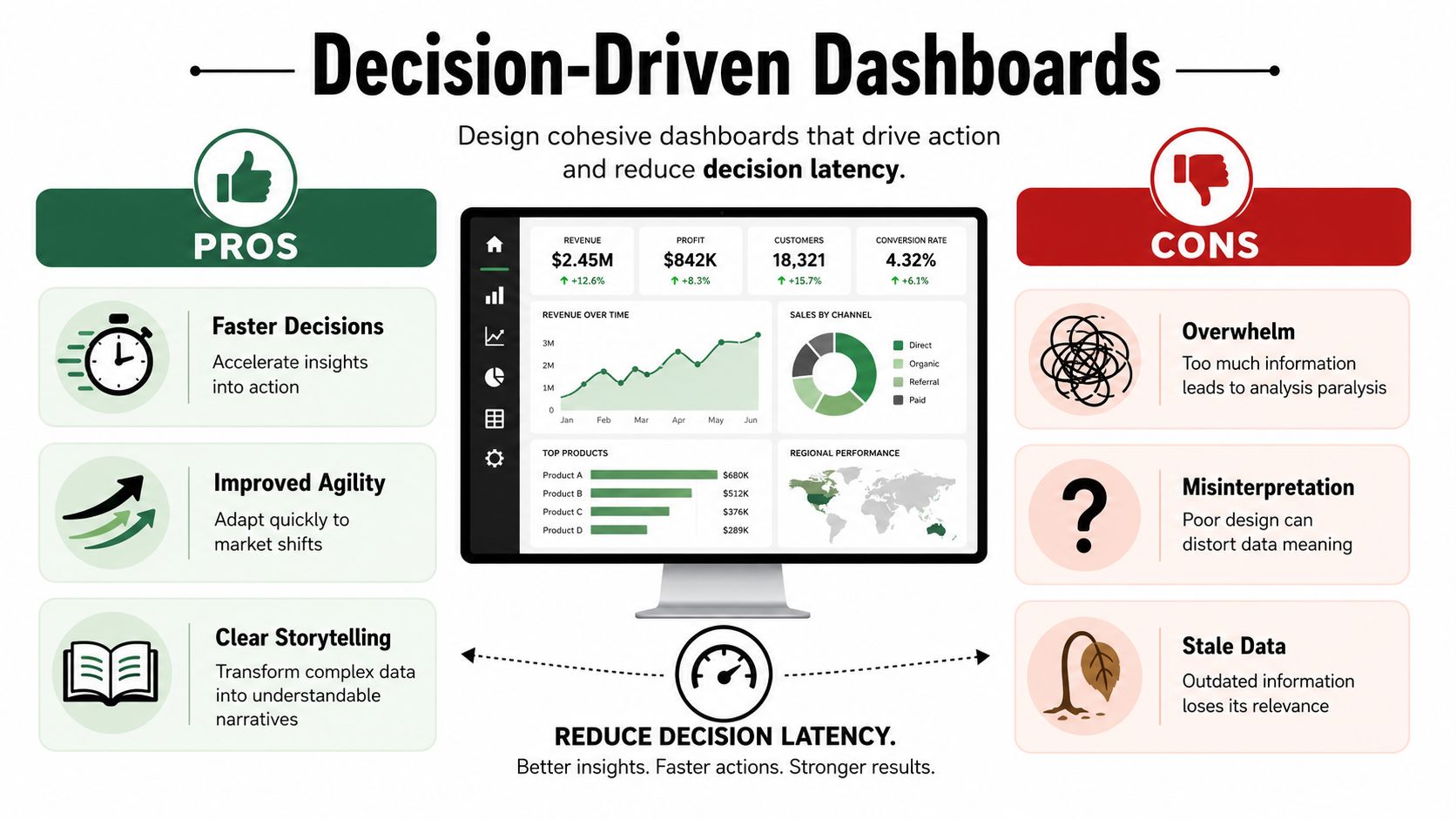
The difference between a useful dashboard and a decorative one usually comes down to two things. First, can people make a decision quickly? Second, do they trust the data enough to act on it? Those two questions shape everything that follows.
Table of Contents
- Start with the decision, not the chart
- A practical chart selection table
- Common chart mistakes in marketing ops
- What strong chart selection looks like in practice
What Is Marketing Data Visualization
Marketing teams don't struggle because they lack data. They struggle because they have too much of it, spread across too many systems, in formats that don't support quick interpretation. Marketing data visualization is the practice of turning that raw data into charts, graphs, heatmaps, and dashboards that make comparisons, trends, relationships, and distributions easier to understand.
That shift became more important as digital channels multiplied and manual analysis stopped scaling. Industry guidance now treats visualization as the practical layer between raw reporting and decision-making, and DashThis notes that readership increases by 80% when content includes visuals such as charts and graphs. In marketing, that matters twice. Visuals help audiences consume information, and they help internal teams understand performance faster.
A good definition is simple. Marketing data visualization is operational communication. It takes numbers that only an analyst can parse and turns them into a shared business view that a campaign manager, sales leader, and CEO can all use.
More than reporting
Old reporting cycles were built around static exports and monthly decks. Modern teams need something closer to a working instrument panel. They need to see campaign movement, funnel health, and channel performance in a form that supports action during the week, not explanation at the end of the month.
Practical rule: If a dashboard doesn't help someone change budget, messaging, targeting, or follow-up, it's reporting history, not managing performance.
The strongest visualizations do three jobs at once:
- Summarize performance: They show what's happening at a glance.
- Expose movement: They reveal direction over time, not just current totals.
- Support action: They make the next decision obvious enough that a team can move without a long interpretation meeting.
What it is not
It's not a technical exercise reserved for analysts. It's also not a design contest.
A dashboard packed with metrics, filters, and bright colors can still fail if nobody can answer a basic question like, “Which source is producing qualified pipeline?” Good marketing data visualization reduces noise. It doesn't add more.
The Business Case for Visualizing Marketing Data
The business case is straightforward. A marketing dashboard works like a car's instrument panel. You don't need to inspect every mechanical detail while driving. You need the few signals that tell you whether to keep course, slow down, or correct quickly.
That's the core value of visualization in B2B marketing. It compresses review time. It aligns teams around the same picture of performance. It replaces subjective debates with visible evidence.

Why teams act faster with visuals
When teams look at raw tables, they spend energy decoding structure before they can discuss meaning. A chart removes some of that friction. A trend line immediately shows whether volume is rising or flattening. A bar chart quickly exposes which channel is underperforming relative to peers. A funnel view shows where handoff problems sit.
That speed matters in weekly operating rhythms. A clean visual can shorten the gap between noticing a problem and assigning an owner to fix it.
The best dashboards don't just answer “what happened?” They help the room answer “what are we changing this week?”
Visualization also improves cross-functional conversations. Marketing ops may think in source data, CRM fields, and attribution rules. Sales leaders care about account quality and pipeline movement. Finance wants consistency. A well-built dashboard creates a common language between those groups.
Where the commercial impact shows up
The value usually appears in a few places first:
- Budget decisions: Teams can compare channels side by side instead of arguing from platform screenshots.
- Funnel diagnosis: Leaders can spot where leads stall, where conversion quality drops, and where follow-up is breaking.
- Executive reporting: Stakeholders get a concise view instead of a stack of exports and disconnected comments.
- Campaign reviews: Managers can see pattern shifts faster than they can in raw spreadsheets.
If you need inspiration for how different B2B companies present campaigns, offers, and positioning, these digital B2B marketing examples are useful because they show how varied the underlying go-to-market motions can be. That matters when you design dashboards. Different motions need different views.
What doesn't work
A lot of dashboards fail for predictable reasons.
- They try to answer everything: One page becomes a warehouse of unrelated metrics.
- They copy platform defaults: Native dashboards often reflect tool logic, not business logic.
- They optimize for presentation, not action: The visuals look polished, but nobody knows what decision they support.
The payoff comes when a team can open a dashboard, identify what changed, understand why it matters, and act without needing a separate data translation session.
Choosing the Right Chart for Your Marketing Question
Most dashboard problems start before the design phase. Someone chooses a chart because it looks familiar, not because it answers a business question well. The fix is simple. Match the visual to the decision.
Industry guidance on CXL emphasizes that marketing data visualization works best when it follows a specific decision workflow, with bar charts for category comparisons, line charts for time trends, and heat maps for correlation or distribution analysis. That's the right starting point because it keeps the chart tied to the job.
Start with the decision, not the chart
Ask the question in plain language first.
“Which channel generated the most leads?” is a comparison problem.
“Did demo requests improve over time?” is a trend problem.
“Which campaign and segment combinations are weak?” is a pattern problem.
Those are different analytical jobs, so they need different visual forms.
Here's a practical way to consider this:
- Use bar charts when people need to compare categories quickly. Channel, campaign, region, segment, or source all fit here.
- Use line charts when the main question is movement over time. Trend matters more than individual values.
- Use heat maps when you need to surface concentrations, weak spots, or relationships across many cells.
- Use tables when stakeholders need exact values or record-level follow-up after spotting a pattern elsewhere.
- Use scorecards sparingly for headline KPIs, but only when context appears nearby.
A practical chart selection table
| Marketing Question | Recommended Chart Type | Why It Works |
|---|---|---|
| Which channel generated the most leads this period? | Bar chart | Easy category comparison. Differences are visible fast. |
| How has website traffic changed over time? | Line chart | Shows direction, momentum, and inflection points clearly. |
| Which campaign drove the most qualified opportunities? | Bar chart | Lets teams compare campaign contribution side by side. |
| When do email engagement patterns spike or dip? | Line chart | Makes recurring timing patterns easier to spot. |
| Which audience segments underperform across campaigns? | Heat map | Highlights weak combinations without forcing people to scan long tables. |
| Where are leads stalling in the funnel? | Funnel chart or staged bar view | Shows progression and where volume drops between stages. |
| Which accounts show the strongest ICP alignment by segment? | Heat map | Useful for seeing concentration by account type or firmographic group. |
| Which reps or teams need exact follow-up detail? | Table | Best after a chart reveals an issue that needs record-level action. |
Common chart mistakes in marketing ops
Some mistakes show up constantly.
A pie chart with too many slices makes channel comparison harder, not easier. Dual-axis charts often confuse non-analysts unless the relationship is very carefully explained. Dense dashboards full of tiny visuals force people to read everything before they understand anything.
A better rule is to assign one clear purpose to each chart. If a chart needs a long verbal explanation in every meeting, it probably isn't doing its job.
When a stakeholder asks, “What am I supposed to take from this?” the problem usually isn't the stakeholder. It's the visual.
What strong chart selection looks like in practice
A pipeline team reviewing lead quality might use:
- a bar chart for lead source contribution
- a line chart for weekly MQL-to-SQL movement
- a heat map for lead score distribution by segment
- a detail table for records that need cleanup or routing review
That set works because each visual answers a different operational question. It doesn't force one chart type across the whole dashboard.
Good chart choice lowers cognitive load. That sounds abstract until you see the effect in a meeting. People stop asking what they're looking at and start discussing what they should change.
From Data Points to Decisions Best Practices
Many dashboards succeed at showing information and fail at creating movement. People understand the numbers, then nothing happens. The missing piece is usually decision latency, which is the gap between seeing data and acting on it.
That gap is still underexplored in common marketing advice. OVRDRV points out that a major gap in data visualization guidance is how to design visuals that help teams act faster, with the best dashboards tailored to a specific audience, annotated with context, and stripped of clutter.
Design for faster action
The first question to ask about any dashboard is not “Does it look complete?” It's “Can the intended viewer understand the takeaway quickly?”
That's why the strongest dashboards are audience-specific. A paid media manager needs spend efficiency, conversion movement, and campaign outliers. A revenue leader needs pipeline contribution, stage health, and source quality. Putting both views on one page usually hurts both audiences.
A few design choices reduce latency immediately:
- Lead with the business answer: Put the most important KPI or chart in the top-left area where attention starts.
- Use titles that state the point: “Paid Search lead quality is slipping” is more useful than “Lead quality by source.”
- Annotate changes: A note explaining a budget shift, audience change, or tracking issue prevents false interpretation.
- Reserve color for meaning: Highlight exceptions, not every object on the screen.
Build a visual path through the dashboard
A dashboard should guide the eye in the same order a team discusses performance.
Start with the summary. Then show trend. Then show breakdown. Then show detail for action. That sequence respects how people process information in meetings.
Here's a practical layout pattern that works well:
- Top row for a handful of headline KPIs
- Middle section for trend and comparison charts
- Lower section for breakdowns, anomalies, and record-level follow-up
That structure works because it mirrors the conversation that teams need to have. What happened? Where did it happen? Who needs to do something?
What slows decisions down
Certain design habits create friction even when the data itself is good.
- Cluttered pages: Too many visuals make stakeholders search for the takeaway.
- Decorative color use: Bright palettes attract attention to everything, which means nothing gets priority.
- Weak labeling: Acronyms and vague chart titles force people to ask for translation.
- No context: A change in performance without explanation often starts the wrong debate.
Operator check: If your dashboard needs a presenter to translate every chart live, the design still has work to do.
Strong dashboards don't just display metrics. They reduce the number of mental steps between signal and response.
The Role of Data Enrichment in Accurate Visuals
A clear chart built on weak data is still misleading. It may even be more dangerous because people trust it faster.
That's the hidden problem in many B2B dashboards. They visualize campaign performance, lead source mix, account coverage, or funnel conversion, but the underlying records are incomplete, mismatched, or stale. Missing titles distort segmentation. Bad company resolution breaks account-level reporting. Outdated contact data can make outreach performance look worse than it really is.
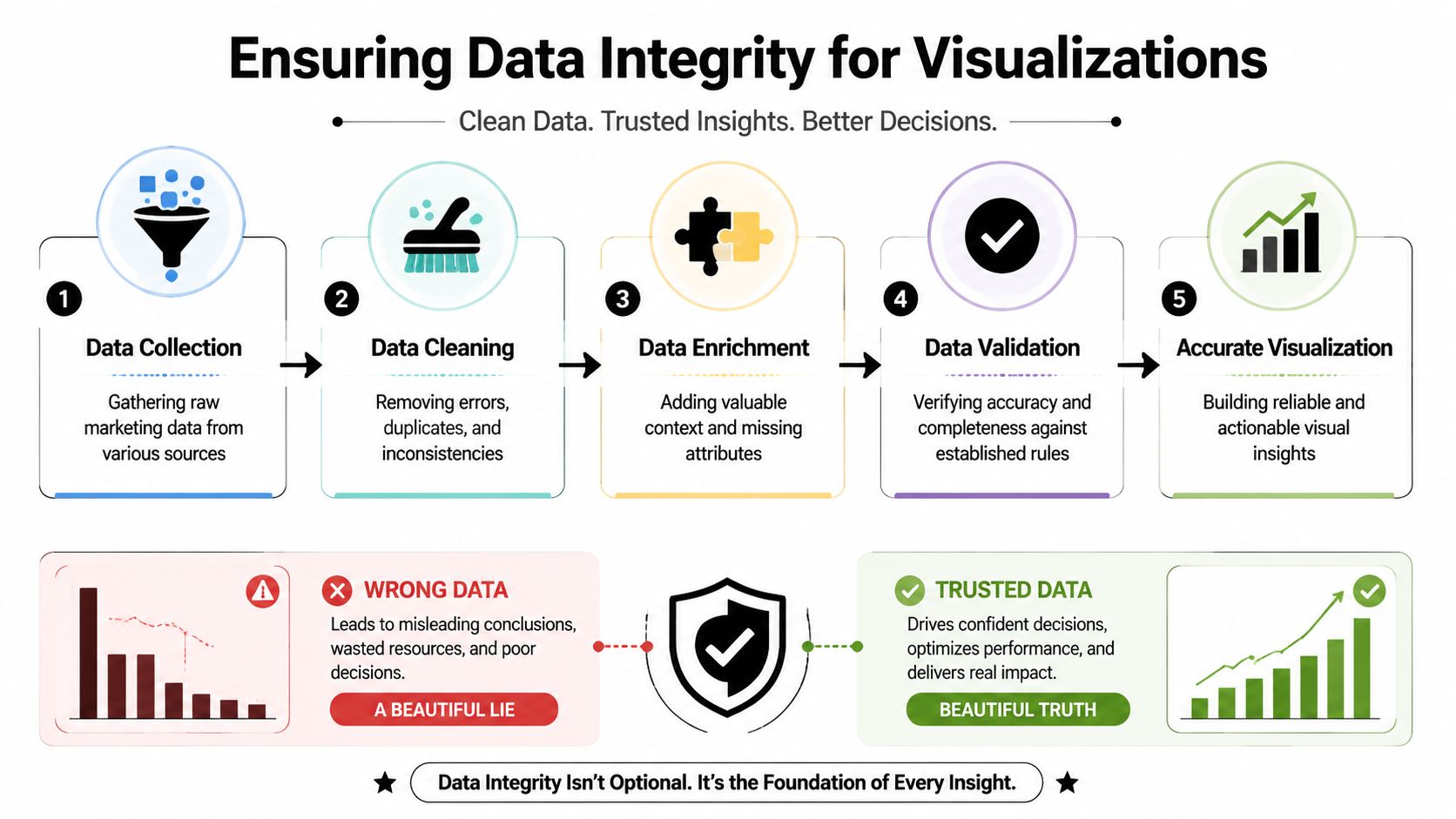
Why clean charts can still be wrong
The trust issue isn't only about formatting or honest axes. It starts much earlier in the pipeline. Oviond highlights that modern marketing dashboards are only as reliable as data identity resolution, freshness, and provenance, and that teams increasingly need ways to show confidence or recency directly inside dashboards.
That idea matters a lot in multi-source reporting. If CRM data says one thing, ad platform data says another, and enrichment data fills the gaps, your dashboard should reflect that reality. Not every metric carries the same level of certainty.
A practical example helps. Suppose you're visualizing ICP penetration by segment. If many leads are missing company size, industry, or role data, the chart may suggest low penetration when the actual issue is incomplete records. The dashboard looks accurate, but the interpretation is wrong.
For teams trying to improve the underlying record quality before they report on it, this guide to marketing data enrichment workflows is useful because it connects enrichment directly to operational reporting.
A platform such as Icypeas fits into that process as one option for finding, verifying, and enriching professional contact data before it reaches reporting layers.
What trustworthy dashboards show
A reliable dashboard doesn't only show performance. It also shows enough metadata for a team to judge whether the performance view is solid.
Useful trust signals include:
- Data recency: When was this metric last refreshed?
- Coverage notes: Are important firmographic or contact fields complete enough to trust segmentation?
- Source labeling: Which system owns the metric?
- Exception flags: Where are records incomplete, unresolved, or under review?
Later in the workflow, a short explainer can help teams connect data quality work to dashboard quality.
The operational trade-off
Enrichment adds complexity. More sources can improve completeness, but they can also introduce mismatches if governance is weak. That's why measurement trust needs rules, not just tools.
The practical standard is simple. Don't ask a dashboard to carry more certainty than the source data can support. If a segment view depends on partially enriched records, say so inside the dashboard. Trust grows when the reporting layer is transparent about what's firm and what's provisional.
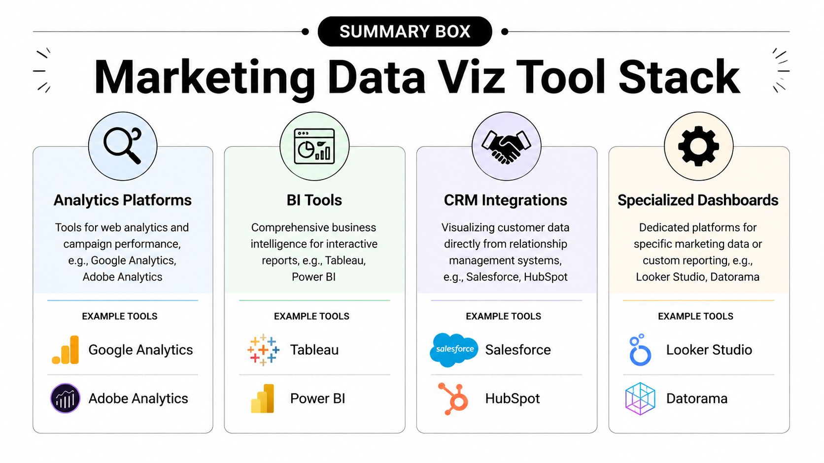
Tools and Examples for Marketing Data Visualization
The tool question matters, but not in the way many teams think. Most dashboard problems don't start with software choice. They start with unclear business questions, weak data models, or visuals that don't match decisions.
Still, the right tool makes the work easier. Marketing teams have been moving in this direction for decades. Visme notes that data visualization became much more influential after business intelligence software rose in the 1980s and 1990s, when spreadsheet tools and dashboard systems made charts and executive reporting routine in corporate marketing. That shift is why modern teams can monitor performance continuously rather than waiting for static reports.
Pick tools based on reporting maturity
Different tools fit different jobs.
| Tool category | Best for | Watch-outs |
|---|---|---|
| Spreadsheets like Google Sheets and Excel | Quick analysis, one-off charting, data cleanup | Hard to govern at scale, easy to break logic |
| Looker Studio | Shareable dashboards for common marketing reporting | Can become messy when models and sources multiply |
| Tableau and Power BI | More advanced modeling, stronger interactivity, broader BI use | More setup, more need for data discipline |
| CRM-native dashboards in HubSpot or Salesforce | Frontline visibility for teams working in the CRM daily | Often limited by CRM field quality and reporting structure |
The choice should reflect operating reality. If one marketer needs a fast weekly view, a spreadsheet or lightweight dashboard may be enough. If rev ops is blending CRM, ad, lifecycle, and enrichment data, a warehouse-backed BI setup is usually safer.
If you're evaluating reporting infrastructure more broadly, this roundup of marketing analytics tools across common use cases is a solid reference point.
Three dashboard templates teams actually use
Weekly campaign performance review
This is the dashboard most demand generation teams need first. It usually includes top KPI scorecards, a trend line for conversions, a bar chart for channel contribution, and a short anomalies table. Its job is weekly budget and optimization decisions.
Quarterly lead source analysis
This one helps leadership review source mix and downstream quality. The useful version compares lead volume by source, adds a trend view, and includes a breakdown by qualification stage. It's less about daily management and more about allocation and planning.
Pipeline coverage by segment
Here, data quality starts to matter more. Teams often need a segmented view by company type, industry, territory, or ICP fit. Heat maps and grouped bars work well here because they reveal concentration and gaps without making people scan thousands of rows.
The right dashboard stack isn't the one with the most features. It's the one your team will maintain, trust, and actually use in operating meetings.
A Simple Roadmap for Your First Marketing Dashboard
Start smaller than you think you need to. Most first dashboards fail because they try to satisfy every stakeholder at once.
A workable first pass looks like this:
Choose one business question
Pick something narrow and operational, such as which channels are producing qualified leads or where leads are stalling after handoff.Select only the few metrics that answer it
If a metric won't change a decision, leave it out. Fewer metrics usually produce a better first dashboard.Use the simplest tool that fits the job
That might be a spreadsheet, Looker Studio, Tableau, or Power BI. The point is clarity, not sophistication.Share it with one stakeholder and watch how they use it
Don't ask whether they “like” it. Ask what decision they can make from it, what's unclear, and what they still need to investigate elsewhere.
If your reporting environment is fragmented, it helps to understand how the data layer supports dashboard quality. This guide to building a marketing data warehouse for trusted reporting is a useful next step.
The first dashboard doesn't need to be complete. It needs to be usable. When it shortens one decision cycle and builds trust with one stakeholder, you've already done the hard part.
Icypeas helps teams improve the data that sits underneath marketing dashboards. If your charts depend on reliable company, contact, and enrichment data, Icypeas can support the collection, verification, and enrichment workflows that make reporting more trustworthy.


.png)


.webp)