.avif)
10 Best Performance Scorecard Templates for 2026


.avif)
Your team already has the numbers. They're in CRM dashboards, manager spreadsheets, board decks, and one-off Slack screenshots. The problem isn't access. The problem is that nobody is looking at the same version of performance, at the same time, with the same definition of success.
That's why most performance scorecard templates fail. They become reporting artifacts instead of operating tools. A usable scorecard should tell a sales leader where execution is off, tell RevOps what data pipeline is broken, and tell managers what to coach this week. If it only helps with quarterly reporting, it's not doing enough.
The strongest setups separate strategic scorecards from operational ones. Strategic scorecards align leadership around a small set of objectives, while operational scorecards help frontline teams act on live data. If you need a broader operating baseline before you build either one, start with a comprehensive business health assessment.
This guide covers 10 performance scorecard templates that teams can use, from classic balanced scorecards and strategy maps to KPI dashboards built for weekly execution. The angle is practical. Which templates work for executive alignment, which ones work for daily management, and how to connect them to enriched CRM data so the scorecard drives action instead of becoming another spreadsheet nobody updates.
Table of Contents
1. Smartsheet Balanced Scorecard Templates
Smartsheet is one of the better options if you want two things at once. You can start with downloadable spreadsheet-style balanced scorecard assets, then move into a more governed live environment without rebuilding everything from scratch. That's useful for RevOps teams that need quick adoption first, then tighter controls later.
The template library includes scorecard-related resources for Excel and Google Sheets, and the broader Smartsheet setup supports dashboards, sharing controls, automations, and activity history through the platform itself. You can see the available resources on Smartsheet's balanced scorecard template page.
Why it works
Smartsheet fits best when leadership wants structure, but the business isn't ready for a full BI implementation. I've seen this pattern often. Ops starts with a strategy map and KPI matrix in a spreadsheet because it's familiar, then quickly runs into version drift, ownership confusion, and no clear audit trail. Smartsheet solves that middle stage better than most template-first tools.
A practical scorecard in this environment should stay tight. Balanced scorecard best practices recommend exactly 8 to 12 objectives across the four perspectives, with 1 to 2 KPIs per objective and an aggregate range of 10 to 15 KPIs to avoid clutter and frustration, according to monday.com's balanced scorecard guidance.
Practical rule: If your Smartsheet scorecard needs a legend to explain every field, you've already overbuilt it.
The trade-off is weight. For a small team with one manager and a handful of weekly metrics, Smartsheet can feel heavier than necessary. But if you need permissioning, change history, and a path from static template to managed operating system, it's a strong option.
- Best for: Teams that want spreadsheet familiarity with better governance.
- Watch out for: Paying for the live features that make the setup worthwhile.
2. Miro Balanced Scorecard Template
Miro is where I'd start if the actual problem is alignment, not reporting. A lot of teams jump straight into dashboard building before they've agreed on what the scorecard should measure. That creates a polished mess. Miro helps you solve the planning problem first.
Its balanced scorecard template gives leadership and cross-functional owners a visual place to map financial, customer, internal process, and learning and growth objectives together. It's collaborative, fast to edit, and good for live workshops.
Best use case
Use Miro for strategic design sessions. Put the four perspectives on the board, force each function to justify why its chosen objective belongs there, and pressure-test whether each metric supports the strategy. If there's disagreement in the workshop, that's good. It means you found the conflict before it got embedded into reporting logic.
This works especially well because modern balanced scorecard practice has moved toward strategy maps as one-page visuals that communicate objectives clearly and connect measures back to goals and projects, as described in Microsoft's PerformancePoint documentation.
What Miro won't do is run your scorecard as a live KPI system. It's not where actual performance management should end.
Miro is for getting the scorecard right. Not for keeping it current.
If your team is still arguing over definitions like qualified pipeline, onboarding completion, or account ownership, stay in Miro until those issues are resolved. Once the structure is stable, move the scorecard into a tool built for execution.
3. Lucid (Lucidchart) Balanced Scorecard Templates
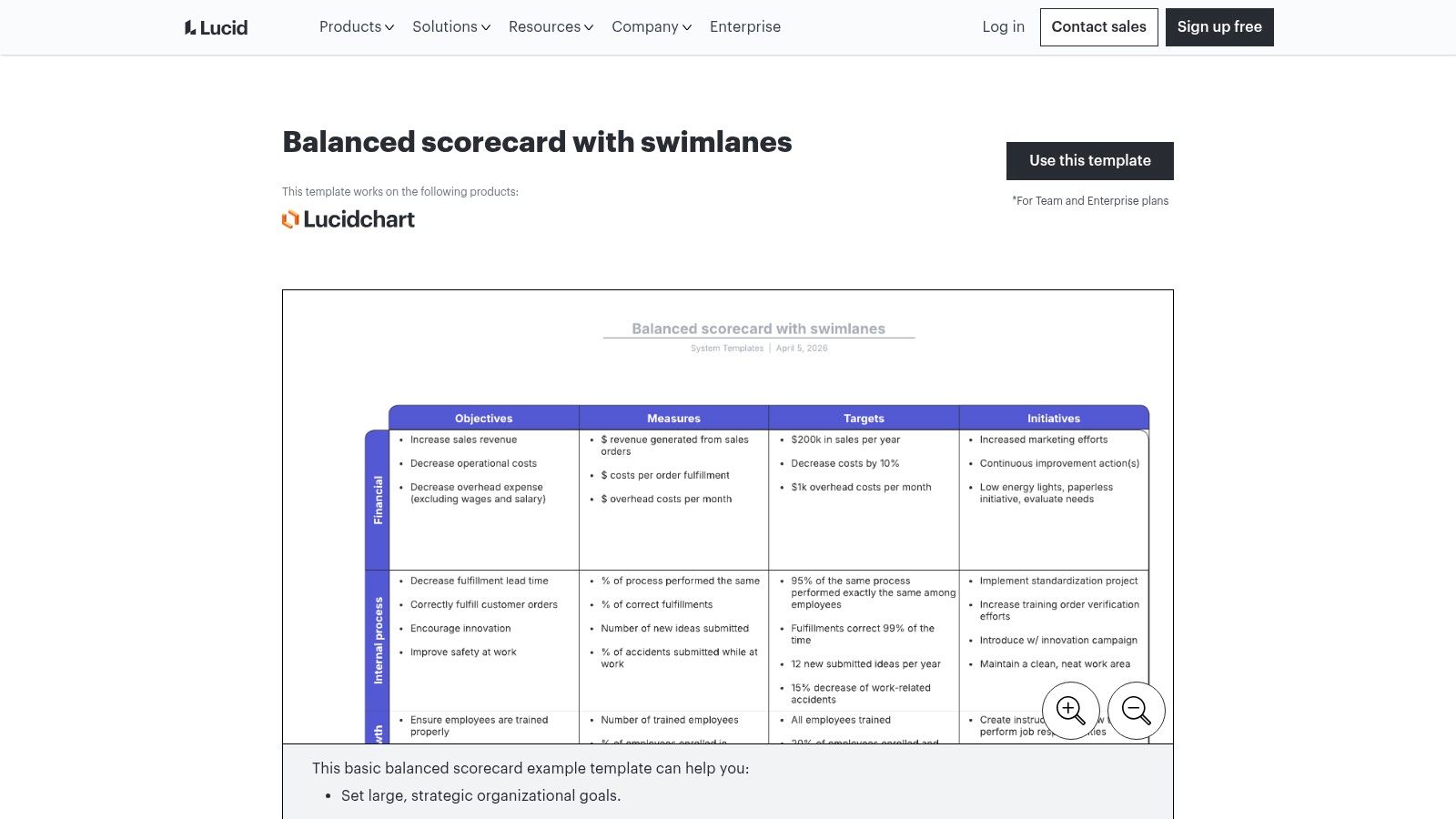
Lucid sits in a similar category to Miro, but it's usually better when the output needs to look cleaner, tighter, and more presentation-ready. If you're taking a scorecard proposal to an executive team, board, or functional leadership review, Lucid often lands better.
Its balanced scorecard with swimlanes template is useful for mapping objectives, owners, initiatives, and relationships in a way that looks structured rather than brainstormed.
Where Lucid fits
Lucid is strong when the scorecard has to communicate accountability. Swimlanes make ownership visible. That matters because many performance scorecard templates fail at the same point. They show metrics, but they don't show who is expected to act when a metric moves off target.
For strategic scorecards in product, data, and operations, teams often use four core perspectives with weighted KPI sets and green, yellow, and red thresholds to support execution in real time, according to Product School's product scorecard article. That framing translates well into Lucid because the diagrams make weighting, ownership, and status logic easier to explain before you build anything operational.
- What it does well: Executive-ready visuals, structured collaboration, clearer ownership mapping.
- What it doesn't do well: Live tracking. You'll still need another system for actual metric refresh and alerting.
If you're trying to get buy-in for a new RevOps scorecard model, Lucid is often the cleaner choice. If you need a workshop canvas, Miro is usually faster.
4. Databox Company KPI Scorecards
Monday morning, the CRO asks why pipeline coverage slipped, marketing wants lead quality broken out by source, and SDR managers need rep-level pacing before the first standup ends. A static template will not help much in that moment. Databox will.
You can review the product on Databox Company KPI Scorecards. Its value is straightforward. It pulls KPIs from connected systems, refreshes them automatically, and distributes the scorecard through dashboards, email, or Slack so managers can work from the same numbers without rebuilding reports by hand.
Best for operational scorecards tied to live systems
Databox fits the operational side of scorecarding better than the strategic side. If Smartsheet, Miro, or Lucid help define what the business wants to measure, Databox helps teams run the weekly rhythm once those decisions are made.
That distinction matters.
A strategic scorecard is built for alignment, planning, and executive review. An operational scorecard is built for action. It needs current CRM activity, campaign data, pipeline movement, and owner-level visibility. For RevOps teams, that usually means connecting sales, marketing, and customer data fast enough that a manager can coach, reassign, or intervene before the week is lost.
For SDR, AE, and marketing ops teams, Databox is useful because it starts with the data layer instead of the presentation layer. You can track pipeline creation, conversion rates, activity pacing, source performance, and attainment in one place. If you are comparing vendors around that reporting layer, these marketing analytics tools for connected GTM reporting are a useful complement.
The trade-off is flexibility versus speed. Databox is faster to stand up than a custom BI build, and far more usable than a static slide or spreadsheet template for day-to-day management. But it is not the best place to design scorecard strategy from scratch. Metric definitions, threshold logic, and ownership rules should be decided before you pipe everything into a live dashboard. Otherwise teams end up arguing about the math inside the tool instead of acting on the results.
Operator note: If managers need to export CSVs before coaching reps, the scorecard is already too late.
Databox works best once you know which metrics deserve daily or weekly attention and you want those metrics fed by real-time, enriched CRM data. That is what turns a scorecard from reporting into operating cadence.
5. ClickUp KPI Dashboard / Scorecard Templates
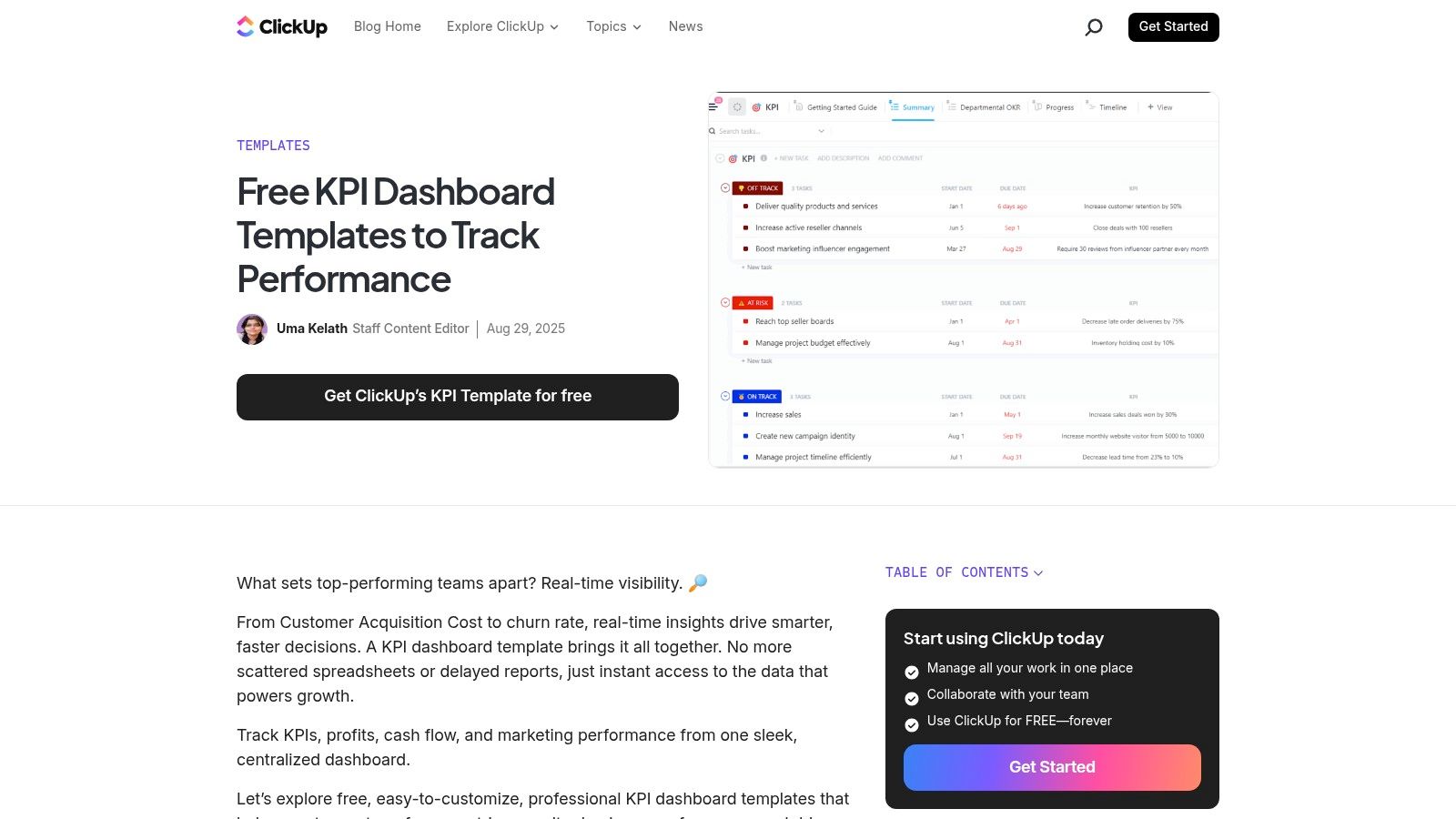
ClickUp works when execution and performance tracking need to live in the same workspace. If your RevOps projects, enablement tasks, campaign launches, and process fixes already run in ClickUp, adding KPI visibility there can reduce a lot of friction.
Its KPI dashboard template collection supports goals, custom fields, formulas, rollups, and dashboards. That's enough to build a decent scorecard for many internal teams.
Best for teams already running work in ClickUp
ClickUp is practical for manager-led scorecards where the next step after a bad number is an assigned task. That's the core benefit. A metric slips, the owner creates a remediation task, and the work happens in the same environment instead of getting lost between a reporting tool and a project tool.
The downside is complexity in metric logic. Once the scorecard needs multiple source systems, nuanced definitions, or BI-style transformations, ClickUp starts to show its limits. It can display and organize performance, but it isn't a purpose-built analytics layer.
This is the pattern where ClickUp usually works best:
- Execution-heavy teams: Sales ops, enablement, onboarding, and internal service teams.
- Simple to moderate KPI logic: Targets, task throughput, SLA compliance, project completion, forecast support work.
- Less ideal use: Multi-system executive scorecards with heavy transformation needs.
If your team already lives in ClickUp, don't overcomplicate the decision. A good-enough scorecard inside the work system often gets used more than a perfect one somewhere else.
6. Notion Team Performance Scorecard Template
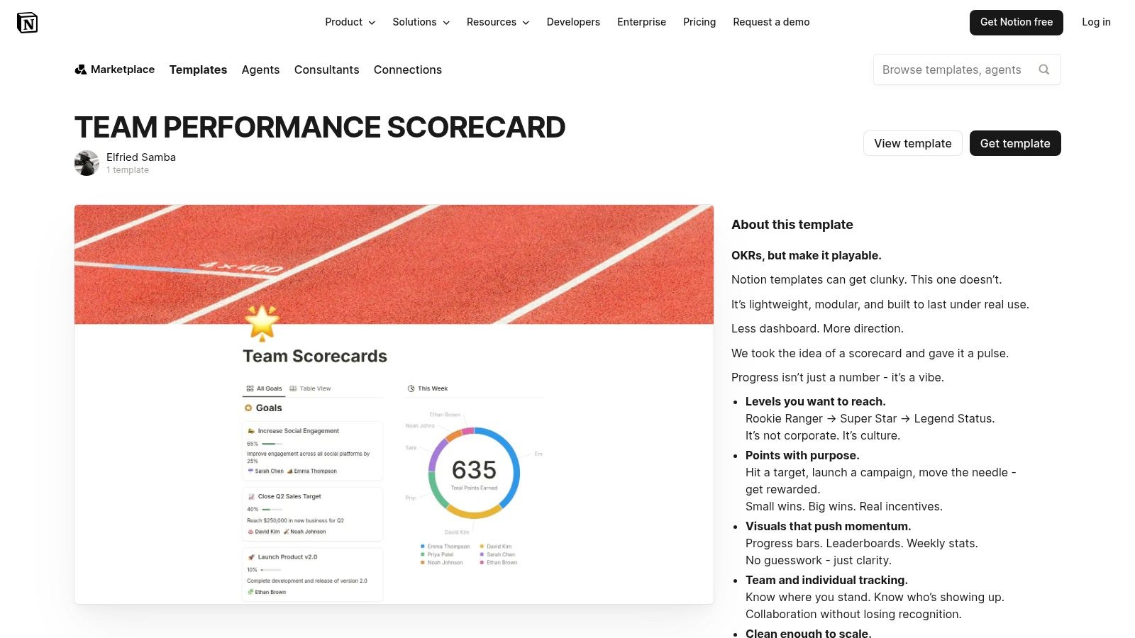
Notion is a solid choice for lightweight scorecards, especially for early-stage teams that value flexibility more than strict reporting controls. It's easy to adapt, easy to share, and often already adopted by the teams that need something quickly.
The template marketplace includes a team scorecards template in Notion. It's a workable base for objectives, metric tracking, updates, and manager commentary.
When lightweight is enough
Not every scorecard needs automation on day one. If a founder-led sales team is still refining qualification criteria, territory ownership, or weekly meeting cadence, a Notion template can be enough to create discipline without overengineering the process.
It's also useful for teams that want performance reviews and operational check-ins in the same knowledge system. For service businesses, a scorecard often works best when it sits near the process docs and review cadence. That's where structured reviews for service-based companies can support the broader operating model.
The best early scorecard isn't the most automated one. It's the one managers will update without being chased.
The weakness is obvious. Notion is not a live data layer unless you add external integrations, and large databases can get messy fast. Use it for clarity and consistency, not for high-frequency automated reporting.
7. Canva Balanced Scorecard Templates
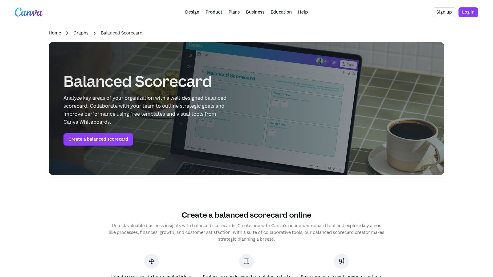
Canva belongs in this list for one reason. A lot of scorecards fail because leaders can't explain them clearly. The underlying logic might be sound, but if the presentation is cluttered, nobody remembers the objectives after the meeting.
Canva's balanced scorecard templates are useful for turning a messy operating framework into a one-page visual that stakeholders can absorb. It's especially good for board updates, executive summaries, and department-level strategy communication.
Best for executive communication
I wouldn't run the operating scorecard in Canva. I would absolutely use it to publish the scorecard. That distinction matters. Operational truth should live in your source systems or connected dashboards. Executive communication should simplify that truth into one page.
Canva is also a good fit when the team needs stronger narrative around the numbers. If your scorecard is part of a broader storytelling layer, this guide to marketing data visualization is relevant because the same rule applies. A scorecard should make performance legible, not just available.
- Strong use case: One-page scorecard summaries for leadership and board reviews.
- Weak use case: Any workflow that requires data refresh, alerts, or drill-down analysis.
For strategic communication, Canva is more useful than many operators admit. It won't manage performance, but it can help leadership understand it.
8. SpreadsheetPoint Free KPI Dashboard (Excel & Google Sheets)
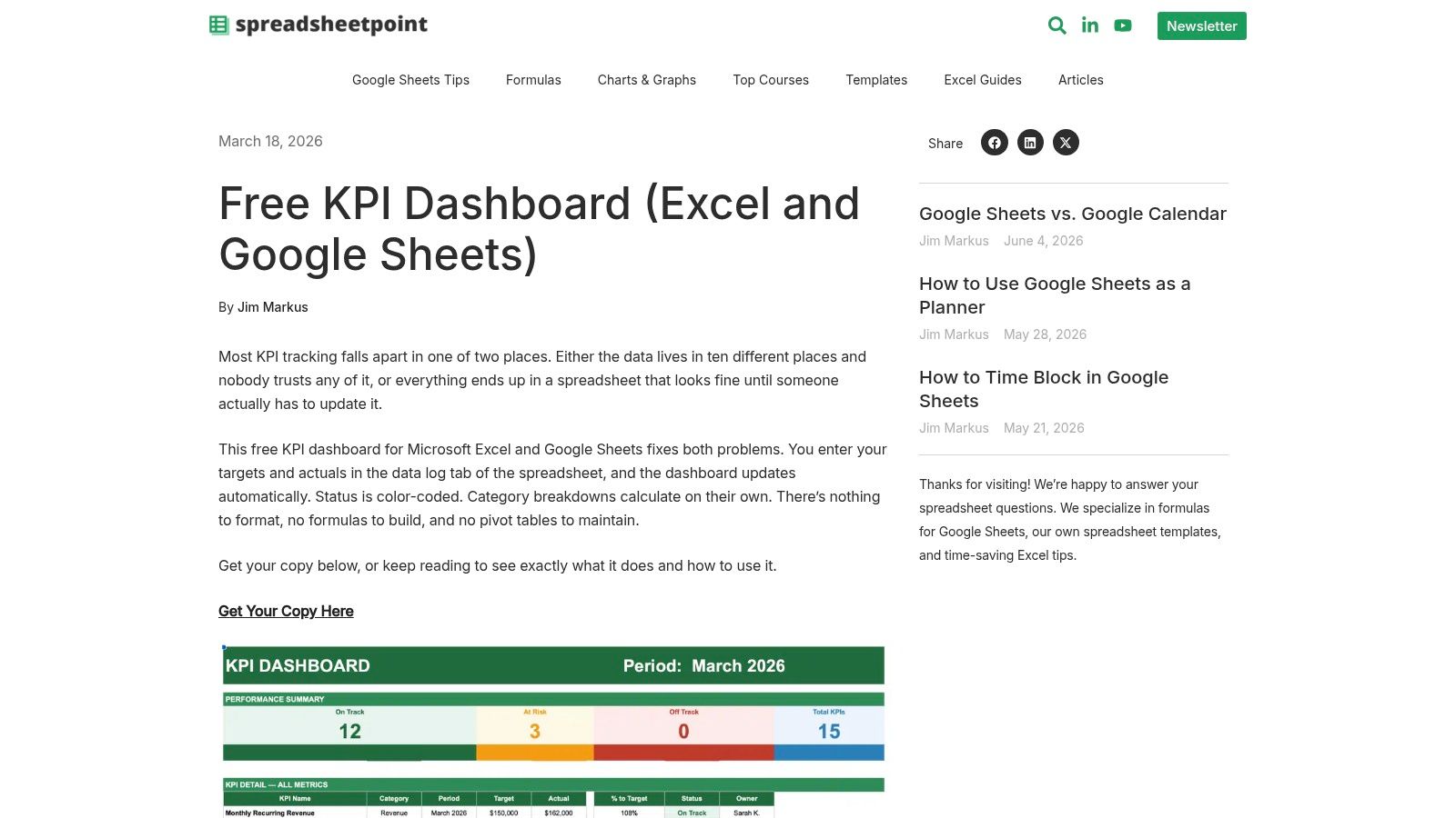
SpreadsheetPoint is the practical no-budget option. If you need a simple scorecard in Excel or Google Sheets today, this is a credible place to start. No buying cycle, no implementation project, no waiting on IT.
The free KPI dashboard template from SpreadsheetPoint gives you a familiar spreadsheet structure with status logic and summary visuals.
A solid spreadsheet starting point
This kind of template works best when the bottleneck is process discipline, not tooling. A manager can define a handful of metrics, assign ownership, and start weekly review meetings immediately. That's often better than delaying for a more complex platform.
The weak spot is data quality over time. Manual updates drift. Definitions split. Someone copies a tab, and now there are three versions of pipeline truth. If your scorecard depends on lead quality, account enrichment, or reliable contact fields, the upstream data model matters just as much as the template. That's where better marketing databases become part of the scorecard conversation.
A spreadsheet scorecard is still useful when you need to prove the management rhythm first. Just be honest about when it has outlived its role.
- Good starting point: Team-level KPI reviews, small-company leadership metrics, pilot scorecards.
- Poor long-term fit: High-volume teams that need auditability, automation, and shared metric governance.
9. Google Sheets Native Scorecard Chart
A sales manager exports weekly activity from the CRM at 8:30 a.m., updates a few cells, and needs a clean answer before the pipeline meeting starts. Are meetings up or down? Did opportunity creation improve? Is lead coverage getting better or worse? Google Sheets can handle that job fast.
The feature is documented in Google Sheets scorecard charts. It shows the current value, compares it with the prior period, and makes the change easy to spot. For operational scorecards, that is often enough.
Best for lightweight operational scorecards
I would use the native scorecard chart for team-level execution metrics, not for executive reporting. It works well for SDR activity, AE conversion checkpoints, follow-up SLA compliance, enrichment completion, or data hygiene trends. A frontline leader can set up a weekly view in an hour and start managing to movement instead of scanning raw rows.
The trade-off is governance. Google Sheets is fast because almost anyone can build in it. That also means metric definitions drift, formulas get edited, and teams start debating the sheet instead of the result. If the scorecard is tied to compensation, board reporting, or cross-functional planning, that risk shows up quickly.
That is why this template belongs on the operational side of the stack. Use it to run weekly team cadence, test metric design, and prove which indicators change behavior. Once the scorecard becomes a shared management system, connect it to live CRM data and enrichment inputs so reps and managers are working from the same definitions in real time.
Google Sheets is a strong bridge tool. It gets a scorecard live quickly, but it also makes the next problem obvious. If updates depend on exports and manual cleanup, the template is no longer the bottleneck. The data pipeline is.
10. Success.co EOS Scorecard Template
Success.co is a good reminder that not every scorecard needs to be elaborate. Sometimes the highest-value template is the one that forces a weekly leadership habit and nothing more.
Its EOS scorecard template from Success.co is built for a straightforward leadership cadence in Excel or Google Sheets, with owners, thresholds, and recurring review structure.
Good discipline for weekly leadership rhythms
This template fits SMBs and scaling teams that need consistency before sophistication. If leaders can't hold a weekly metrics meeting with clear owners and threshold logic, a more advanced dashboard won't fix the underlying discipline problem.
There's also a strong alignment with common balanced scorecard practices here. Effective templates use red, yellow, and green thresholds to show whether performance needs intervention, warning-level attention, or is on target, as outlined in the previously cited monday guidance. That simple status system sounds basic, but it changes behavior because leaders can spot problems without decoding a wall of raw numbers.
A weekly scorecard meeting should answer three things. What moved, why it moved, and who owns the response.
The limitation is depth. Success.co won't satisfy teams that need complex visualization, multi-source automation, or heavy drill-down. But for leadership cadence and accountability, simple often beats clever.
Top 10 Performance Scorecard Template Comparison
| Tool | Core features ✨ | UX / Quality ★ | Value / Price 💰 | Target audience 👥 | Best fit / Unique strength 🏆 |
|---|---|---|---|---|---|
| Smartsheet Balanced Scorecard Templates | Ready Excel/Sheets downloads, native live template, automations ✨ | ★★★★ | 💰 Free templates; full live features need Smartsheet license | 👥 Enterprise ops, strategy, PMs | 🏆 Governed, auditable scorecards & migration path |
| Miro Balanced Scorecard Template | Pre-structured board, real-time collaboration, exports ✨ | ★★★★ | 💰 Freemium; advanced sharing on paid plans | 👥 Leadership workshops, cross-functional teams | 🏆 Fast facilitation & visual alignment |
| Lucid (Lucidchart) Balanced Scorecard Templates | Editable BSC diagrams, swimlanes, presentation mode ✨ | ★★★★ | 💰 Freemium; team features paid | 👥 Execs, RevOps, presenters | 🏆 Presentation-ready, clear visuals for stakeholder buy-in |
| Databox Company KPI Scorecards | Auto-generated scorecards from integrations, alerts, mobile ✨ | ★★★★ | 💰 Paid tiers for connectors; strong automation ROI | 👥 SDR/AE, growth, analytics teams | 🏆 Near-zero-maintenance live KPI delivery |
| ClickUp KPI Dashboard / Scorecard Templates | KPI widgets, Goals, rollups, custom fields ✨ | ★★★ | 💰 Included in paid plans; verify plan limits | 👥 Teams already in ClickUp (ops, enablement) | 🏆 Consolidates tasks + KPIs in one workspace |
| Notion Team Performance Scorecard Template | Database-driven scorecard, flexible properties, comments ✨ | ★★★ | 💰 Free/paid; manual updates unless integrated | 👥 SMBs, early-stage sales teams | 🏆 Lightweight, fast-to-adopt weekly check-ins |
| Canva Balanced Scorecard Templates | On-brand, editable visuals, brand kits, exports ✨ | ★★★★ | 💰 Freemium; Pro for brand features | 👥 Marketing, comms, execs | 🏆 Polished one-page executive summaries |
| SpreadsheetPoint Free KPI Dashboard | Spreadsheet scorecard, status logic, trends (Excel/Sheets) ✨ | ★★★ | 💰 Free download | 👥 Cost-conscious ops, small teams | 🏆 No-cost, familiar spreadsheet starter |
| Google Sheets Native Scorecard Chart | Built-in scorecard visualization, live collaboration ✨ | ★★★★ | 💰 Free for Google Workspace users | 👥 Teams using Sheets/CRMs | 🏆 Quick, real-time collaborative scorecards |
| Success.co EOS Scorecard Template | Weekly EOS format, owners, thresholds, Excel/Sheets ✨ | ★★★ | 💰 Free template; optional paid platform | 👥 SMB leadership using EOS | 🏆 Low-friction weekly leadership accountability |
From Scorecard to Action Plan
Choosing among performance scorecard templates is less about features and more about operating intent. If you need strategic alignment, start with a visual planning tool like Miro, Lucid, or Canva. If you need operational control, lean toward Databox, Google Sheets, ClickUp, or Smartsheet. If you just need a simple weekly management rhythm, SpreadsheetPoint, Notion, or Success.co can get you moving quickly.
The bigger mistake is trying to use one scorecard for everything. Executive scorecards and frontline scorecards serve different jobs. Leadership needs a compact view of strategic objectives. Managers need live indicators tied to actions, owners, and next steps. When teams force both jobs into one template, the result is usually too abstract for coaching and too noisy for strategy.
A workable setup usually has two layers. The first is a strategic scorecard with limited objectives, clear ownership, and threshold logic. The second is an operational scorecard that refreshes more often and reflects the actual workflow of the team. In RevOps, that operational layer should connect to your CRM, enrichment stack, outreach tooling, and task system. Otherwise managers spend the meeting debating data quality instead of fixing performance.
That's where enriched CRM data changes the value of a scorecard. If lead records are incomplete, account ownership is wrong, or contact data is stale, the scorecard becomes misleading even if the template looks polished. A daily SDR scorecard only works when the underlying records can support territory routing, persona segmentation, deliverability checks, and pipeline attribution. Clean data isn't a reporting nice-to-have. It's the operating substrate.
The implementation path doesn't need to be complicated. Start with the template that matches your current maturity. Keep the scorecard narrow. Assign one owner per metric. Define what each status means. Review it in a fixed weekly rhythm. Then tighten the inputs. Add automation where manual updates are slowing response time. Replace static exports with connected data feeds when the business outgrows spreadsheet maintenance.
The teams that get the most value from scorecards don't treat them like a monthly presentation asset. They use them to run the business. A good scorecard tells a manager what needs intervention. A great one makes it obvious what to do next.
Icypeas helps teams turn scorecards into reliable operating tools by fixing the data underneath them. If your performance scorecard depends on clean accounts, verified emails, enriched contacts, or up-to-date CRM records, Icypeas gives RevOps, SDR, and marketing teams the enrichment layer needed to make those metrics trustworthy. That's especially useful when you're building operational scorecards tied to pipeline creation, territory coverage, outreach quality, and lead routing, because better scorecards start with better data.


.png)


.webp)